March 29, 2019

Scrapbook Friday - Layout 3

Welcome back to the third layout created from the 5 sheets of design paper I picked. I am still working with only those sheets of design paper plus cardstock that I add.

The base for the layout is simple white cardstock. I also used Close to My Heart cardstock in the colors SweatLeaf and Charcoal.


I try to keep these pages simple so if you are a beginner you can tag along without any problems. The whole purpose of this tutorial and the upcoming ones is to show you how far 5 sheets of design paper and cardstock in matching colors and take you. Can you do more, sure, but for now I like to keep it simple. 

For this layout you would need the following cut papers:
- 2 sheets of white cardstock 12"x12" as the page base
- 1 sheet of sweatleaf cardstock where you cut 2 pieces of 6"x10" from
- 1 sheet of charcoal cardstock where you cut 2 pieces of 7"x4" from
- 2 strips from the heart design paper cut at 1"x12"
- and 2 strips of the heart paper cut at 3/4"x3 1/2"

Like in my previous pages I placed the cut pieces on my base and moved them around until I ended up with the design you see here:


Your pictures might be different or you have more you like to add to the page, so play around with them and see how they would fit best for you. I had the challenge that I wanted a little bit of variation in size to make the page more interesting.
The pictures on the left page are cut at 4"x5" and two are cut at 4"x4".
The pictures on the right page are cut at 4"x4', 5"x3 1/2" and 5 1/2"x4".

Like I mentioned in last weeks post, I didn't feel like matting the pictures was needed
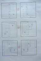
, so all that was left was to find the right position for them. This is the sketch I used for this layout here.

Here are a few more ideas on how you can use the same elements on your page, but positioning them in different ways. Believe me, there are many more possibilities to arrange them, so try what you like.
I hope this will show you how you can use one sketch and change it to multiple different layouts. Give it a try and see how different each page will look like. 
TIP: I sometimes move things around so much that I can't remember the first ones :-) I know it gets confusing. So take out your camera or phone and snap a quick picture of each layout you dry fit together. Then sit back and scroll though them so see which one you like the best....save a lot of headaches.


Reminder: These pages are not finished. Journaling and embellishments will be done ones the pictures are all placed. 

March 27, 2019

Card Class Project March - 2/4


Today we are using the Close To My Heart stamp set "Know That I Care" (C1752) and the pretty Lilac Cardstock.

The front paper is cut at 5 1/4"x4" and adhered to the front of the card base with the lighter color side facing up. A strip of Lilac cardstock is cut at 2"x4" is adhered to the front with the darker side facing up.

The white cardstock is cut at 3"x4". We used Charcoal ink to stamp the flowers and Pixie ink to stamp the inside of them. Pixie ink looks darker when you stamp it, but once completely dry is lightens up.

The doted paper is cut at 3 1/4"x4 1/4". Adhere the white paper in the center of the doted paper. Finally a piece of Charcoal cardstock is cut at 3"x4". We adhered this one offset to the right and bottom of the doted paper. The completed piece is then raised with foam dots and placed on the front of the card.

The "Let's Celebrate" phrase is also stamped in Charcoal ink, cut out and placed with foam dots onto the flowers. A few rhinestones finishing of this card. Well all most, we did decorate the inside with a few extras.


March 25, 2019

Home Crafty Home Special

Looking for a super cute home décor idea? How about this beautiful workshop set?

With the Home Chipboard Monogram workshop, you can create a papercrafting project that is sure to add a cozy touch to any room! This workshop uses chipboard monogram letters and easy-to-cut shapes from the Cricut Design Space™ project file created just for this workshop. You can order this set until April 30st.

Dates: March 8, 2019 (12:01 am MST) – April 30, 2019 (11:59 pm MDT)

March 22, 2019

Scrapbook Friday - Layout 2

Today I continue my quest to create more scrapbook layouts with the 5 design sheets I picked for this project. So let's see how many layout I can get out of these 5 sheets.


After we created the starting page last week, this week we concentrate one the second layout, a double page. I cut two strips of the sheet with the red design at 2" x 12", and four strips 1" x 12" of the paper with the little hearts. I also used two strips 1/2" x 12" of the Charcoal cardstock. 
Our Close to My Heart cardstock is two toned, meaning one side is a darker and the other a lighter hue of the color. I chose the light charcoal side so the color isn't to potent.

Material used for this layout:
- 2 sheets of white cardstock as my base
- 2 strips of the red design paper cut at 2"x12"
- 4 strips of the heart design paper cut at 1"x12"
- 2 strips of charcoal cardstock cut at 1/2"x12"

In order to make the strips a little bit more interesting I decided to cut a little triangle in the two bigger strips. 


This time I arranged my pictures a little bit different than I normally would do them. Placing them of set or overlapping sometimes goes against my nature :-) Yup, I like them straight and nice even spaces between them, but sometimes a little off is so much better.
On the left side all pictures were cut at 5" x 3 1/2". How you arrange them is up to you. all depending what your photos show. On the right side I cut the photos at 5" x 3 1/2" and the piece of cardstock (also charcoal lighter side up) at 5 1/2" x 4". This could be a place mat for some journaling or another picture. I still have room to embellish, but this will have to wait until all my photos are in place.


Here is a close up picture of the papers I used and the order how they are attached. The little hand drawn sketch is the one I used for this layout, but you know you can create so many different layouts with just the same paper cuts? Yes, the possibilities are endless. Here are just a few more variations:


 There are  more possibilities, but I think this gives you an idea how to use them in different way. Again this all comes back to the point what pictures you have and how many you want to use on your page. Before you start adhering your papers, make sure to lay them down on your cardstock, place you pictures on top and see what it looks like. Move them around and see if another positioning might fit better. I do this all the time and often I find a different one to fit better than the one I picked to begin with.

Last you might ask, why didn't you mat your pictures? Well, that is a good question and there is not really an answer too it. Yes, you can mat all your pictures, but is it necessary, No!
The beauty of laying all my papers and photos down and move them around before I adhere them, gives me an idea if I think my pictures need a mat. In this case here I thought they are fine without a mat. Sometimes a mat can take away from your pictures and other times it can make them stand out. So it is a personal preference and what pleases your eyes.

Reminder: These pages are not finished. Journaling and embellishments will be done ones the pictures are all placed. 


March 20, 2019

Card Class Project March - 1/4

This beautiful flower is created with the current "Love Blossoms" (CC2199) stamp set. This stamp is still available until March 31st.

First we used a 5 1/4"x4" piece of Ballerina cardstock and run it through the Swiss Dot embossing folder (which is sold out). I do love the little dots and the border it creates.
If you like to create a similar impression, use a dot embossing folder and partial emboss the paper. Then place the piece on a softer surface and use a ruler and stylus and score a finishing line or two about the embossed part. Be careful not to apply to much pressure or you perforate your cardstock.

Next we stamped one of the "Love Blossom" flowers in Pixie ink onto the top of the paper (the part were we didn't emboss)

We also used a partial of the stamp and the same ink to stamp on the inside of the card.


For the flag part, we cut a piece of white cardstock at 2"x3 3/4". We stamped the "Thank You" towards the right side and then cut the fin part. The little strip below the flag is cute at 1/4"x3".

For the thread part, wrap the thread a couple times around two of your fingers, remove from your fingers. Hold the bundle together at the two ends. Press everything into a small glue dot and place the glue dot on the card front. The dot will be covered with the flag.

The flag is raised with a few foam dots and the small strip is adhered just below the flag on the base.

The inside phrase is stamped with the same Charcoal ink we used on the front. A little doodling on the inside and we are almost done. We used a clear Shimmer Brush (Z3293) to accent the middle of the flowers and the berries.


March 18, 2019

Special in March - 35% on Pocket Cards

Close To My Heart is continuing to celebrate 35 years of  creativity and they are sharing this success with us. Yes, 35 years and counting! So here is another super deal for you:

Up until March 31st you will receive 35% off Picture My Life™ cards from Seasonal Expressions 1! Coordinating with each paper collection, these cards help you extend your creative options in your memory keeping and even your cardmaking. You can find all set included in this deal right HERE...

Dates: March 15, 2019 (12:00 am MDT) – March 31, 2019 (11:59 pm MDT)

March 15, 2019

Scrapbook Friday - Let's get started

Today I like to get started on some real layouts. I thought it would be interesting for you to see how many layouts you will be able to create from just a couple of design papers and cardstock sheets. 
I will be using 5 design paper sheets from the current Close to My Heart paper called "I Heart Us" (X7242B) and some matching cardstock. (remember, right now you can buy a paper pack and/or coordinating cardstock pack and get a second one 50%).
The beauty of our design paper is that it is double sided so you have one design on one side and a different one on the other. But before we go into detail, a little prep-work is needed.

I picked a few of the pictures I will be using to show you what difference a cardstock color can make. 


I know the picture quality isn't perfect, but it still show quite nicely the differences. The first color cardstock is Bluebird, followed by Lagoon and Mint. Mint clearly makes the pictures look very dull. It is almost as if the cardstock color removes the color out of the picture. Lagoon and especially Bluebird on the other hand really make the colors in the pictures pop.


Next we have a look at the a variety of different pinks. First off is Pixie, next Raspberry and last Thistle. In this case Raspberry actually is a bit to bright for the pictures, while Thistle and Pixie support the photos. In upcoming posts I'll have more pictures of old structures where the pink really works well with the stone colors.

Last but not least is a green colored cardstock called Sweet Leaf which works well with the greens in the pictures. 

So after sorting thought these colors and comparing them with my pictures I decided to work with a few different ones. Bluebird and Lagoon for sure. Sweetleaf, Pixie and Thistle are also on my list.

Beside these main colors I will add a few neutrals into the mix. You can never have enough neutrals on hand. I always have White, Black, Browns and Greys on hand. Close to My Heart offers a great variety of neutral colors and one of my absolute favors is Charcoal. For those of you who are not familiar with the cardstocks from CTMH, try them. They cut super nice and easy and they are "two toned"... meaning one side of the cardstock is of a darker hue and the other one is of a light hue of the same color.
So here are the photos, colors and papers I will be using:

I will add the neutrals on the go and remember each design paper you see will have a different design on the other side.

Now lets start with the first page, shall we?


Materials used:
1 sheet of Bluebird cardstock 12"x12"
2 strips of design paper cut at 1 1/2"x12"
2 strips of White Glitter paper cut at 1/4"x12"

My photos are cut at:
- top row: 2 photos at 5 1/4"x2 1/2"
- middle row: 3 photos at 3 1/2"x3 1/2"
- bottom row: 2 photos at 5 1/4" x2 1/2"

Before I adhere all pieces in place I like to lay them down and see how they look. Sometimes I move them around to see if something else works better. In this case move them to the sides of the page or place them to the top and bottom. I decided the top - bottom one was my best fit.


Regarding the double-sided design paper, my first choice was the darker greenish side of the paper. I did try the back and in picture 2 you can see how this looked like. Clearly the lighter blue didn't work so back to choice one.

I adhered each design strip flush with the bottom and the other one with the top of my cardstock sheet. Next I added the small glitter paper strip. For the pictures I spaced them out with just a little space between them, starting with the top row. Followed by the middle row. For the middle row I adhered the right and left photo first before I centered the middle one between them. This makes spacing them easier. Finally all that is left are the pictures in the bottom row. 
I have one picture left over, but this one I will cut down to just a small one, maybe a round one? I will have to play with it and do my journaling and add a title. So next week this page will be completed. 
I will get started with the next layout using the left over design papers and cardstock so tune in next Friday to see the new layout. 

What do you think, how many layouts can I create from 5 sheets of design papers? Leave a comment down below :-) Thanks for reading and see you soon...


Reminder: These pages are not finished. Journaling and embellishments will be done ones the pictures are all placed. 


March 13, 2019

Card Class Project February - 4/4


This is our last card from the February cardmaking class. We used one more time the "Know That I Care" (C1752) stamp set. This time we stamped a phrase from the set on the tag and to the inside of the card. We also used the little leave to add a few more touches.

We folded about 1/3 of the card front over. We then adhered the grey design paper to the left of the card, adhered the folded over flap to the remaining front and then adhered the grey cardstock to the rest of the front. The grey cardstock was run through an embossing machine. Due to the white core in the Close to My Heart cardstocks you can see a little with shining through.

The leaves are lightly colored with a regular pencil and a little bit of ribbon is wrapped around the front. The end as adhered on the inside and back of the card. A few sequins finishing this card off.


March 11, 2019

Love Blossoms Special in March

I know you have seen this here before, but it is such a great kit and stamp set that it would be a shame to miss it. This cute special is only available during the month of February & March and while supplies last and there are already some options that are gone!


So what is this set about?
You can create a set of 12 charming cards in our wonderful pastel tones Carolina, Lilac, Peach, and Pixie.  This card workshop uses a wonderful exclusive My Acrylix® Love Blossoms stamp set which contains one sheet of words and phrases for tags on the front of your card and for the inside. 
Like all our workshop, this one features dry embossing techniques using the new Swiss Dot embossing folder. This embossing folder has been so popular that the workshop kit including the embossing folder is no longer available. You still can order the embossing folder on its own, but you better make sure to order it now because it is in high demand and might run out before the end of March.

Dates: February 1, 2019 - March 31, 2019

This new "Love Blossoms Workshop" can be ordered the following way:

- Love Blossoms workshop kit (CC21912) includes the stamp set, cardstock, four Exclusive Inks™ mini stamp pads, silver embellishing thread, and cards and envelopes needed to create twelve cards. These kits are offered at 20% off the retail price.


- Love Blossoms base kit (CC21913) includes only the cardstock, silver embellishing thread, and cards and envelopes for another set of 12 cards. It's a perfect addition to the main workshop so you will be able to create even more cards with your set.

- Love Blossoms Stamp Set (CC2199) contains a total of 23 individual stamps like flowers, words and phrases. This stamp set is a great edition for any card maker even if you are not interested in the workshop kit.


One more special treat for you: 
if you live in the Fenton area and would like to join a card making class where we create these wonderful cards together please contact me for more detailed information. I will teach you the different techniques used in the workshop and we will create 4 beautiful cards for you to take home. Interested? Don't forget to email me for more information.

March 8, 2019

Scrapbook Friday - Crop Weekend

I Forgot the Date!

It is Spring Crop Camp in Davisburg and I am all set up and ready to go since Thursday and guess what? Yup, I totally forgot my blog post for today. Since I won't have access and I don't want to quickly scribble something down, I figure it is best to postpone it. 
Please check back on Friday, March 15th for the next episode of "Scrapbook Friday". Here is a little sneak peek on some older page layouts I made :-)
Sorry again and hope to see you next Friday....well and in between ;-)


March 6, 2019

Card Class Project February - 3/4


Here we are with card No.3 from the February card making class. We are still using the super cute "Feels Like Home" paper pack (X7243B) and the "Know That I Care" (C1752) stamp set. The stamp set is really pretty. You have the outline of the flowers and then you have a stamp for the inside of them. This inside stamp leaves like a watercolor impression and since it doesn't line up with the outline stamp it is fool prove to stamp with ;-)

We used a regular white card base and adhered a piece of design paper from the "Feels Like Home" paper pack to the bottom of the card front. A strip of "Lilac" cardstock on top of the paper and three little pearls in the corner.

For the center piece we used "ballerina" cardstock for the base and white cardstock to stamp on. Both layers are adhered together and raised with foam dots.

We left the inside of the card simple. We stamped one more time the flower bouquet and added a few doodles with a fine black pen.


March 4, 2019

35 Years of Close To My Heart - Special for March

BOGO Paper and Cardstock Sale in March


A papercrafter can never have too much paper, right? That’s why Close To My Heart invited you to join them for a Paper Party! Buy any paper packet or coordinating cardstock package this month and get another of equal or lesser value at 50% off! There’s no limit to the number of paper packets or cardstock packs you can get at the 50% off price, so order as many as you want! The regular cardstock packs of one color are not included in the deal!
You can find design paper packs including the cardstock as a bundle RIGHT HERE...
or just look for the paper section and pick and choose :-)

Offer valid March 1–31, 2019.( Shipping and  handling assessed on retail value of all items.)


March 1, 2019

Scrapbook Friday - The best way to find scrapbook page layouts

So now that we know what scrapbooking is, what we should do with our pictures and what albums and papers to pick, let's focus on how to find inspiration.

I get inspired with many things and everywhere. Sometimes it is a color combination, a flower bouquet, an outfit, a design on a sweater … anything could be an inspiration. But yes, I know, if you are a beginner this doesn't really help, right? So let's go back to basics shall we?

These days "social media" offers a ton of layout ideas. Pinterest or Instagram for example, just search for page layouts and you will spend hours looking through them. Craft Magazines are also a great way to start but there are not many out there anymore. If you happen to have a Close To My Heart Idea Book well there you go, you got a free inspiration book in your hands. Many layouts and the design papers and cardstock colors all right in front of you.


Let's face it, you don't have to invent the wheel again. It is perfectly fine to copy a layout you see and give it your own little spin. Use different papers and embellishments and call it a day. But for those of you who like to work with a detailed instruction to a page (sketch) there are books out you can use to get started. The instructions include exact measurements of papers and photos and how and where to position them. I often look back into those to start my base and then work from there. Often my picture are not the right direction or they need to be bigger or smaller, but I can make this work. Again if you are new to this, just follow the instructions.

Our Close to My Heart "How to Books" are perfect to get started. You can search the layouts by how many photos you like to use on your page or you just look at the examples and pick the one you like best. If you find sketches online, perfect, use those for your project and always remember they are just ideas and you can change them. Take the design and flip it up-side-down or move things from left to right. Turn it 90/180/270 degrees...one layout design gives you so many more options.

"Make it from Your Heart - Volume 1" is a great way to start and you might want to pick up "Volume 2" too because they both contain super cute layouts including all measurements.

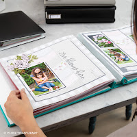
We also have a newer version "Make it from Your Heart - Volume 3" which uses one of the small 6"x 8" ring albums like you see here above. Anyone of these will get you started and I will show you in the upcoming weeks how to use them.

Again a lot of layouts are included in each of these books. The are not relatively inexpensive and I think they can give you a wonderful start into the work of scrapbooking. Try one of them let me know how you like them or if you life in my area come by and check them out in person.

For those of you who are having a hard time to pick color combinations, there is another book out for you. It is called "Love of Color" and uses the small ring album as well. Here you will get introduced into the world of color and it is pretty interesting to refresh your school memories about colors....Love it! But you can always  just go with the flow and see what you like and what works with your picture :-)

If it comes to scrapbooking, like with any other craft, there are no real rules on how to do things. It is up to you to decide what you like. I am scrapbooking together with two lovely friends ones a month and we all have a different approach on things. I like to somewhat measure and follow the pattern, but my one friend just eyeballs things. You can be super exact with your layout or you be free spirit, just try.
While I said before there are no rules, well there is always an exception, right? Yes, if you are a quilter you want to measure and follow guidelines otherwise your quilt might not be looking good. Or if you use templates to create your pages, yes you want to follow the measurements there too otherwise it will be a mess.
But if we are talking about a "normal" page layout, just try it. I often cut my papers and place them with my pictures on the cardstock I chose for the background. No glue, just lay them down and move them around. See what looks good to you. Well, this is hard to explain. It is better if you can see this in real, so next Friday we will start with a layout. Simple step by step instructions, promise :-)
See you next week...…..