So after I took care of the flowers form the garden I was faced with a boat load of wonderful orchid photos. All these wonderful close-ups, but how do I get them on my pages?
Inspired by the last flower page I did, I thought "Why not stick with the same design?".
I created three piles of flowers...red/ orange, pink/ purple and everything else.
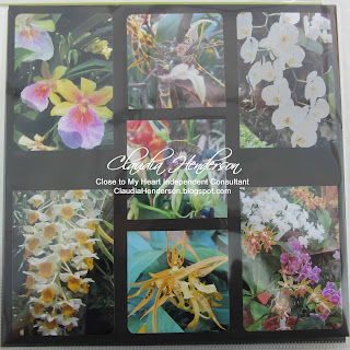
Next I determined which part of each photo was my focal point. Knowing that I wanted to keep three rows. It turned out one row with three photos of 3 1/2" square size and two rows with two photos 3 1/2" wide and 5" long.
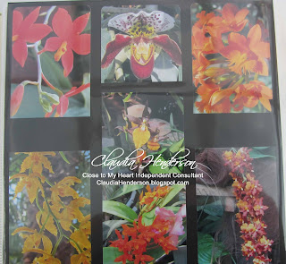
Keeping the same layout for all three pages makes it not only easier for your eyes to look at, it is also less complicated for you to create the pages.
I decided to keep the bigger pictures on the outsides and the three smaller once in the middle. This gives me a little room for journaling.
I continued with the black cardstock as my background since this was the only color that worked with the photos. Color enhancing and still showing off each flower.
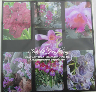
Matting was not an option at this point, because I felt that this simple way of display was enough. I have some of the Orchids names and I plan to write them underneath the pictures with a white gel pen. I don't think I will ad anything else. Let the flowers speak for themselves.
You can always use one of the new pocket sheet protectors to make it really easy. Mixing them with your regular scrapbook pages is a great way to get a lot of pictures scraped.
Close to My Heart offers a "Memory Protectors Variety Pack" (Z3026) of these pocket sheets. Or try one of the "Flip-Flaps" (also available in 12" length) to add more pictures.
If you like to know more about this technique or how to use the pocket protectors or the flip-flaps, let me know, I would love to help you.
Like to join a monthly crop? Contact me for more information.
October 30, 2015
October 26, 2015
"Simply Fundamental Scrapbooking"
Here is a sneak peek for the upcoming November campaign from Close to My Heart.
The November campaign is called "Simply Fundamental Scrapbooking" and is a collection of awesomeness... if I might say so!
This workshop bundle includes on of the new "My Legacy" albums and a package of products to fill your album right away. All you need to get are you photos.
You get to pick the "My Legacy" album of your choice. Pick from the D-ring style coming in Cocoa Damask, Slate Circles, Ruby Floral, Lagoon Chevron or simply in Black. Don't like the D-ring albums? How about our Post-Bound albums coming in these designs: Cocoa Damask, Slate Circles, Ruby Floral, Lagoon Chevron and the always beauty Black.
Further each bundle, no matter what design, color or style, will include a package of our "Paper Fundamentals Enchantment" (Z3126) pack. 20 double-sided papers 2 each of 10 designs in gorgeous colors. But that's not all.
Your bundle will also include the "Fundamental Assortment Peacock" (Z3098) seen here on the left.
Lovely paper bows with gold and silver foiled designs ... 6 of them; Wooden stickers ... 6 of them;
Cute little plastic clips ... 8 of them;
and finally a 6" x 6" sheet of glitter stickers.
All these embellishments work perfectly together with the paper pack and the 3 extra sheets of "Daisy White" cardstock.
And there is more, you will also receive the "Fundamental Stickers Enchantment Pack" (Z3164) seen here on the right, which includes many more stickers.
To be exact, this set includes a total of four 12" x 6" sheets in four designs:
- Alphabets
- Titles
- Labels
- Icons
And on top of all this, you can pick for FREE a pack of our "Memory Protectors". Pick between the
Top Load Value Pack (Z1984) or the Side Load Value Pack (Z1977)! This is a savings of $19.95...yeahhhhh!
Doesn't this sounds great. Take advantage of this great bundle offer, which will be only available with the FREE value pack from November 1st until November 30th. If you like to know more about the bundle or if you have any other questions, please feel free to contact me.
You will be able to order the bundle via my website starting November 1st or you can email me your wishes. A PDF with layout suggestions will be available as well and as a special for my customers, you will receive a special layout PDF from me designed for you!
Here are a few samples of layouts you can do with this set...but there is more. Don't miss out and contact me today!
October 23, 2015
Part 3: "Island of Mainau" Pages (Pocket Protectors)
As I mentioned before, the Island of Mainau is known for the flora and fauna they call home. Many exotic plants grow here, but also many native species. So which of the many wonderful photos should I take? That was my biggest question. Especially since we had the chance to explore an orchid exhibition during our visit.
First I took the close ups form the flowers we captured in the gardens. I places them on a piece of black design paper from the "Snowflake" paper pack from Close to My Heart. I cropped the pictures to about 3 1/2" and kept one picture a bit longer.
Why did I use black as a background? Black enhances the bright and vibrant colors of the flowers even more. It also makes each flower stand out on its own. I tried other backgrounds, but somehow the flowers got lost. To off set them even a bit more, I matted four of them with some yellow cardstock.
If you have many photos form one subject, like nature, a football game of your kits etc...you might want to try the new pocket pages that are out there. This makes it even easier to crop them and all you have to do is put them in the pockets. Try it and mix them up with your regular scrapbook pages....
Stay tuned for more flower pages next week...
If you like to scrapbook or need some help or just want to join a monthly group, let me know...
October 22, 2015
Fall Camp Scrap in Davisburg, Michigan
It is this time of the year again... Fall Camp Scrap!
A weekend filled with laughter and fun. The Camp Scrap is held at the Oakland Fair Grounds in Davisburg, Michigan. No matter if you are paper craft, if you like to sew or if you do any other type of crafting all types are welcome here.
The fun begins tomorrow
Thursday, October 22nd and ends Sunday, October 25th, 2015.
For those of you attending the camp, come see me in the back on Friday and Saturday and enjoy a "Make & Take", brand new products and page layouts and so much more.
Let the fun begin and I will see you all on Friday and Saturday at the Fall Camp Scrap in Davisburg
October 21, 2015
A Butterfly sympathy card
Here is card no# 2 from the September card making classes. Sorry that these pictures are a bit dark, but I didn't realized the sun was behind a cloud when I took those.
I used a regular daisy white cardbase. Further I used two strips about 3/4" wide from smokey plum cardstock and another piece of daisy white cardstock about 3 1/4" wide.
This card is stamped in the 1st, 2nd and 3rd generation stamping technique. In what? you might ask...
... I used smokey plum ink and inked my water-brush stroke stamp up very very good. You need a nice layer of ink.
Then all you have to do is stamp it on the white piece of cardstock, lift the stamp and stamp right underneath the first image without re-inking and you do the same procedure one more time. Your stamped image gets lighter each time you stamp which creates this wonderful effect. Let the ink completely dry so the real color will show.
In the meantime, edge around the two smokey plum cardstock strips and adhere them on the right and left side of your card.
Next you use the second flower bundle that comes with the Close to My Heart stamp of the month set "Paper garden". I stamped this flower image in slate (a darker grey) right above the three strips I did earlier.
Stamp you phrase with black ink onto the white piece in the lower right corner.
The cute butterfly is from one of our Close to My Heart exclusive Cricut cartridges. I adhered it with some liquid adhesive just along the body part of the butterfly. This way you can bend the wings up a bit. A thin silver wire piece is wrapped around the front and a few silver/black sequins from the Sequins Silver Assortment (Z2013) finish the front up.
Place a few foam dots on the back and adhere the piece in the center of your cardbase. The piece if flush with the top and bottom and will reveal the smokey plum cardstock on each side.
Don't forget to place an extra set of flowers on the outside of your envelope!
If you are interested in this or any other cards seen here on the blog, please feel free to contact me.
You can also learn how to make your own cards by joining one of my card classes. Just come and try one class and see how much fun it is....Contact me for dates and times.
Stay tuned for more to come...
October 16, 2015
Part 2: "Island of Mainau" Pages
How many times have you seen layouts in magazines or during craft shows that were so wonderful decorated? How many times have you asked yourself, how much time it would take to make these?
I did and I know how much time and material goes into such projects. But let's be honest, I am not creating all my pages in such a elaborate style. Once in while, when I have a shot of a lifetime, I will go over the top with a layout, but for the most part....no way!
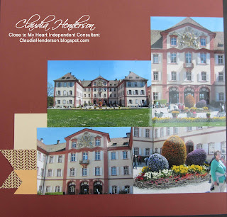
For me it is all about the pictures and therefore the way I position them to tell my story. This layout here is a perfect example. The island of Mainau is known for the tremendous amount of flora and fauna they have. In the middle of the Island you will find the castle with the attached chapel and the solarium. I did trim the photos a bit to create the pyramid shaped layout.
So what did I end up using for this layout? Two pieces of 12" x 12" cardstock from Close to My Heart in barn red, two small pieces of design paper from the Pathfinding paper pack and four pieces of scrap cardstock that I found in my stack!
I will add a title to this page and out tickets from the entrance and maybe a little bling (like pearls or rhinestones if needed). Oh and most important a little journaling block. So even with just a few pieces of paper you can create a wonderful layout...or what do you think?
If you have difficulties to find a perfect layout for your pictures, try one of our awesome books. Close to My Heart has two booklets which contain page layouts and a few card ideas. They are called "Make it from your heart" Volume 1 (9035) and Volume 2 (9042). You can also try one of the other books from the "How-To Program". They are bigger than the booklets and contain therefore more layouts. But if you just want to test the books, go with the booklets first....You will get the other once later anyway ;-)
Like to join a monthly crop or need some support in creating your own pages...contact me, I am happy to help!
October 14, 2015
Watercolor Effect - Thank You Card
Well, I started my card classes up again in September. I hope everyone had a great summer. Hard to believe I am posting this and it is already October...What happened you might ask? Sometimes you really have look deep into your handmade items to find something to put on your blog and then...
... then are these times when you have so much, you don't know when to post it all. So let's play some catch up with last months card class creations:
You might remember the wonderful stamp of the month that Close to My Heart had for September? "Paper Garden" was the name of this set and it let to some wonderful creations.
Here is our first card, just saying "Thanks". I used one of the stamps from the "Paper Garden" set to create the stamped image you see here. A piece of Bamboo cardstock to stamp on and a pieces of white and smokey plum cardstock to mat the image.
The image itself was inked up with sponge daubers to archive the multi-color effect. First I applied sunset, then thistle and finally the pear color. If you are interested to learn more about this technique or many others feel free to contact me!
A strip of whisper grey cardstock was stamped with the little grid stamp from the set. I used whisper ink to stamp the image.
My cardbase is covered with a piece of black cardstock.
I first adhered the flower image and the piece of white cardstock. I then wrapped the grey twine around it and raised it with some foam dots of the smokey plum piece.
Last I adhered the "thanks" word to the card. This one was cut out with the Cricut machine. A few pearls and this card is done.
Well, I hope you like this card and if you are interested to join one of my classes and see for yourself how much fun it is to create your own cards, let me know. I have my class schedule displayed on the blog, but if time and date does not fit our schedule contact me and we see if we can find a solution for you.
You can also always buy any of my projects shown here....contact me!
October 9, 2015
Part 1: "Island of Mainau" Pages (Mosaic Technique)
Remember the vacation pictures I had on my blog a few months ago? Castles and flowers from a little trip in Germany we took earlier this year.
Well here are the first (almost finished) pages from our trip. Yes, I finally started on a regular base to scrap our vacation pictures and you will be able to see a few of them here on my blog. Fridays is usually "page" day.
I established a monthly page workshop with two wonderful ladies were we get to work on our own pages. Lot's of fun and we get finally something done ....yeahhh
So lets go over the pages for a moment. We took so many wonderful pictures that is was really hard for me to narrow them down. But always remember, a few good ones are all you need. I actually started with the right side of the layout first.
Hard to believe, but I used 10 photos on this one page! They are cropped, but this mosaic technique (special paper needed!) allows you to blend multiple different photos or part of photos to one nice collage. I kept two of my favorite shots intact and use some of the many flower ones to fill in the rest. Each little square is 1" and a little journaling block rounds this collage up.
For the left page I have chosen a more simple layout to offset the busy mosaic on the right. I used the same accent colors in between to photos to connect with the right page. I still need to do some journaling, a title and maybe add some ticket stubs to the page.
Like to learn the mosaic technique? Contact me....stay tuned....more to come!
October 8, 2015
October - Stamp of the Month "Twinkle"
Christmas is on its way and this months Stamp of the Month "Twinkle" is a wonderful edition to your current collection of Christmas stamps.
Don't you think so? Create your own little string lights, tags and tree decorations with this set. Need some new phrases and words for cards, pages or your presents? Look at the new options you will have with this set.
Remember, you can buy this set only during the month of October and believe it or not, you can add it to your regular order of $50 or more and it will cost you only $5 extra.
October 5, 2015
October Special from Close to My Heart
Let's see what Close to My Heart came up with this month...
but first, can you answer me a few questions? Yes? Well here we go...
- Do you love to craft?
- Do you love to work with people that share your interest?
- Do you like to be creative and show others how they can be creative too?
- Have you every thought about turning your passion into a business?
If you answered one or more of these questions with yes, I think this is a great opportunity for you. How about joining my Close to My Heart team this month? Show others what wonderful products and ideas Close to My Heart has to offer and inspire them with your creativity. Don't be shy and give it a try. I will support you and help you on your way to be a successful consultant.
Check out all the great items you will receive in your personal consultant starter kit (click here). Your kit will be filled with products that make the start into your new adventure simply wonderful...a value of approximately $445 for only $129 plus this month you will also receive the awesome 2015 convention bag for FREE. Start your business in style....and don't miss out...start it now!
October 2, 2015
Tri-Fold "Home in Tuscany" Cart - Part 2
Welcome to part 2 of the 'Home in Tuscany" tri-fold card.
Now the fun part begins, coloring it. You can use any coloring medium you like, just make sure you stamped the image with the fitting ink for your medium. If you decide to use alcohol markers, be sure to keep the card open during coloring, since the alcohol markers have the tendency to bleed through the paper. This also means you have to cover the insides of your left and right side with some cardstock!
I decided to color my card in with some watercolor pencils. I started with the side panels and ended with the middle section of my card.
Lets start with the "Table for Two". Feel free to pick any color combination you like. To get some shading into your scenery, make sure to use lighter and darker colors and blend them together.
As you can see on the left, I didn't smooth the colors out at all, that's because I used watercolor pencils, which I can smooth out with water at the end.
Here is a picture of the colors after I blended them with some water.
I used darker colors under the table, on one side of the posts and in the leaves. In some areas I left white spaces so I could blend the color form the side out.
Once my imaged was colored in, I went ahead with a fine brush and just a hint of water. The brush should feel almost dry to the touch.
I always start from the light color to the dark, so from the light blue into the dark. I made sure the lines between the shades that I created are smoothed out completely.
Here are a few more pictures to show you that coloring in with watercolor pencils does not have to be too accurate.
You can see lines and dark and lighter colors and that's ok, since our next step will blend them together.
As you can see on the right picture, the colors are blending very well and no lines are be seen anymore. The inside of my panels are also nice and clean, so I don't really need to cover them with cardstock, but I will since I think is looks better.
Here the inside of the card before I used the water...
... and after I used the water.
To give you an idea how the card looks when you open it...
left picture shows the opening of the left side and the right picture shows you the other side....
And the Tri-Fold completely closed. I love these cards...something different to give.
Stay tuned for the finished card with cardstock and embellishments.
Would you like to create this card? Would you like to learn how to stamp a tri-fold card and how to use watercolors? Well contact me for class dates.
Subscribe to:
Posts (Atom)